2025-26 city edition rankings
- Jack Anderson
- Nov 12, 2025
- 6 min read


Another year, another fresh batch of city edition jerseys, though there are many that are retreads.The theme this year was to bring back a city edition of the past in a way, many did not bring back exact replicas. and some teams did that well while other did not. Let's break it all down and rank them.
30: Hornets

Give the Hornets credit for taking a shot here, it didn't work but give them credit for trying. There is just too much going on here for me. The yellow feature raises a question, why do they wear teal? Hornets have no teal in them.
29: Pelicans

The first retread on this list, worn during the 2023-24 season, New Orleans wore these jersey's before and for some reason they are wearing them again. They are ugly and I won't stand for it!
28: Trail Blazers

The Blazers are bringing back the carpet jerseys, that were originally worn during the 2022-23 season. If you don't know, these jerseys are based on the Portland airport carpet! The jersey's are bad and corny and they don't have an alternate court with them so they are even worse due to the mismatch with court.
27: Clippers

These are just bland and boring. Orange is a throwback to the Buffalo Braves which is fine but these are not a needle mover for me. Red and navy is great Clippers look and orange just doesn't work.
26: Warriors

Brown, really? These are super bland and super boring to me. I do like 'The Town' concept but the color scheme pushes these down for me.
25: Cavaliers

There is no need to make a peach jersey. I don't have much to say on these, another year with this weird circle above the L in 'Land.' I just don't like these colors mixed together when wine and gold are so nice, though they have somehow runied that too with their icon (typical away) jersey's.
24: Jazz
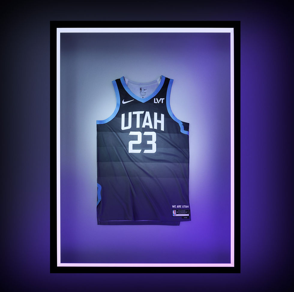
Ah yes, the famous gray sunset. The Jazz have consistantly been at the top of these lists but since they made purple their primary color so this is a fine trade off. However, if they want to go with sky blue than commit to sky blue!
23: Knicks

Can we get a Knicks city jersey that is not white/cream (these jerseys are cream collored even though they look white). Can we just get a new vibe on these city jerseys from the Knicks? Although the blue in 2024 were nice, they should have brought those back.
22: Pistons

These are cool, I like the mix of colors the Pistons are using here. I just think they miss by just enough to fall to 22nd on the list. There is a lot of different colors here that cause it to fall.
21: Celtics

Did you know that this is the first time the Celtics don't have green in a jersey? Oh, you had. Well, hopefully they keep it that way. Why didn't Boston wear these jerseys the year after the championship?
20: Raptors

The white dinosaur doesn't work for me. If you take if off of the jersey, this is a boring jersey that lacks red. If they had just worn the jersey the dinosaur is wearing, they would have been near the top 5. Those were great jerseys. Also, Toronto needs to bring back purple full time.
19: Hawks

Another retread, worn during the 2019-20 season. I don't hate these, the Peachtree wording is cool and the colors mesh well, I just don't love them.
18: Wizards

These are a big swing by Washington and I don't think they missed but they also did not hit a home run. The white at the Nike logo and advertisement is not great but the gold is a cool concept and the number font is cool. These just miss on being a great jersey.
17: Lakers

Another retread, worn during the 2023-24 season . I like these better than most people do, the triangle of the lettering bothers people but I don't hate it. I like a Lakers black jersey but if they are going to wear a black retread, why not go with the Black Mamba jerseys?
16: Nuggets

A great call by the Nuggets are bring these back. Worn during the 2019-20 season, the rainbow and mountians are cool. Not a top tier jersey but a good look for Denver.
15: Thunder

I like these jerseys by OKC. The mix of the blues works with the dark navy on the shorts and bottom of the jerseys and the brighter navy (is that a thing?) contrasting it well. The light blue on the shorts and side pannels works to and they mix in orange well.
14: Suns

The Valley jerseys are back, worn during the 2020-21 and 2021-22 seasons. We all remember these looks from the Suns 2021 Finals run and the 2022 game 7 against the Mavericks. I would argue these are more of a classic look than a city edition look. They wore these jerseys for every home playoff game for 2 seasons. I feel nestoglic looking at these jerseys, which is weird to say about a jersey worn this decade. I am a fan of these jerseys and the shorts are underated, the side pannel works on them.
13: Bucks

The Cream City jersey is back for the Bucks. Worn during the 2019-20 season, the 'Cream City' part, while funny, is a bit bizzare but the I do like the color of the jersey along with how there isn't a lot going on with the jersey. It is basic but it works. It also is not blue, though blue is featured, which is something I have constantly complained about for the past few seasons with the Bucks.
12: Nets

These are pretty much the Nets regular icon edition with 'Brooklyn Camo' side pannels. A retread from the 2018-19 season, these jerseys are inspired by famous Brooklyn rapper The Notorious B.I.G. and are a great look. Though I do prefer the 2019-20 Bed-Stuy white jerseys better. If the arm sleves are not the same design as the side pannels, like they were the first time Brooklyn worse these jerseys, we will riot.
11: Sixers

These are the inverts of the 2019-20 city edition jersey. These look like the Clippers current icon jerseys but with white lettering, which I am a fan of. The sleve linging with the red, white and blue mesh well with the navy base too, these are a hit from the Sixers.
10: Kings

A purple Kings jersey, what a concept! The side pannels are great and the mix in of light purple is a major success for the Kings. Enough of the gradient jersey, bring back purple!
9: Grizzlies

I am a fan of this white uniform. The stips, the neck colar, side pannel, all of it is working for the Grizzlies.
8: Rockets

A retread from the 2023-24 season, these were ranked number 1 that year. H-Town lettering is great, the red mix with the white base is great and the astronaut on the shorts is fun.
7: Mavericks

The blue and black mix, the silver lettering and the font is all great. The side pannels are not my favorite but these are great overall.
6: Magic

I am not typically a fan of a gray jersey, these I am a huge fan. The stars on the side pannel and the throwback lettering work very well. The mix of this whole jersey is great.
5: Bulls

These are a black version of the Bulls 2017-18 city edition. The flag theme works, the script lettering, the blue lettering with red outline and the stars on the side I am a fan of all of it. These are great.
4: Pacers

These are really great. They are something similar to what they had in 2021-22, when I ranked them dead last which I would not have done today. I think I would have prefered navy instead of royal on this jersey but this unifrom works and I am a huge fan of it.
3: Spurs

A retread from the 2020-21 season for the Spurs and they are beautiful. The three stripes across the chest really pop on the black. The San Antonio lettering is fantastic as well. These are a hit.
2: Heat

The vice jerseys are back, these are the 2018-19 edition. Last year, Miami finished dead last in these rankings with the red Heat Culture jerseys, now they are 2nd. The black is great, the blue wording, the pink numbers and the blue and pink sleeves all of it is great. The vice jerseys will always be famous to me
1: Timberwolves

Our number 1 jersey is a retread, don't you love it when teams bring back great jerseys? Take notes Washington. Anyways, these were originally worn during the 2018-19 season. The mix of dark purple and the light purple mesh so well and the font of the front lettering pops off of the page. These are a huge hit for the Wolves.
Those are my city edition rankings (which do you really need anyone else's?) Any takes of mine you disagree with? If so, comment below! All photos are from NBA.com.


Comments